How to Select the Perfect Website Color Scheme
Ever wondered why tech giants like Facebook and LinkedIn use blue, while food brands like Zomato or Swiggy lean into reds and oranges? It’s not an accident. Colors trigger emotions and influence how users interact with your site.
Whether you are building a professional portfolio or a tech blog, choosing the right palette is the foundation of your brand identity. Here is how to do it right.
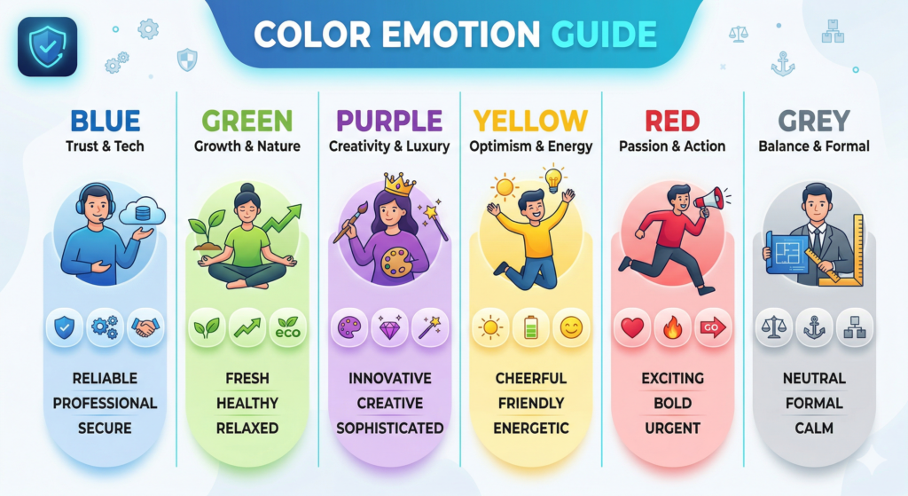
1. Understand the Psychology of Color
Before picking a hex code, decide how you want your visitors to feel.
- Blue: Trust, security, and technology (Perfect for “Techie” brands).
- Green: Growth, health, and relaxation.
- Black/Dark Grey: Sophistication, power, and modernism.
- Yellow/Orange: Energy, friendliness, and optimism.
2. The 60-30-10 Rule
To keep your website from looking cluttered, professional designers use the 60-30-10 rule. It’s a simple formula for visual balance:
- 60% Primary Color: Usually a neutral color (white, light grey, or dark mode black) used for the overall background
- 30% Secondary Color: Your brand’s main personality color (like the cyan in your favicon) used for headings and sidebars.
- 10% Accent Color: A contrasting color used strictly for Call-to-Action (CTA) buttons or important links.
3. Use Tools to Generate Palettes
You don’t need to be a color theorist to find colors that match. Use these free tools to generate professional schemes:
- Coolors.co: Great for quickly generating random, harmonized palettes.
- Adobe Color: Best for exploring professional trends and “Extracting” colors from an image you like.
- Happy Hues: Shows you how colors look on a real website layout before you commit.
4. Prioritize Accessibility (Contrast is King)
A beautiful site is useless if people can’t read it. Ensure there is enough contrast between your text and your background.
- Avoid: Light grey text on a white background.
- Tip: Use tools like WebAIM Contrast Checker to make sure your site meets WCAG accessibility standards. This is crucial for SEO and user experience!
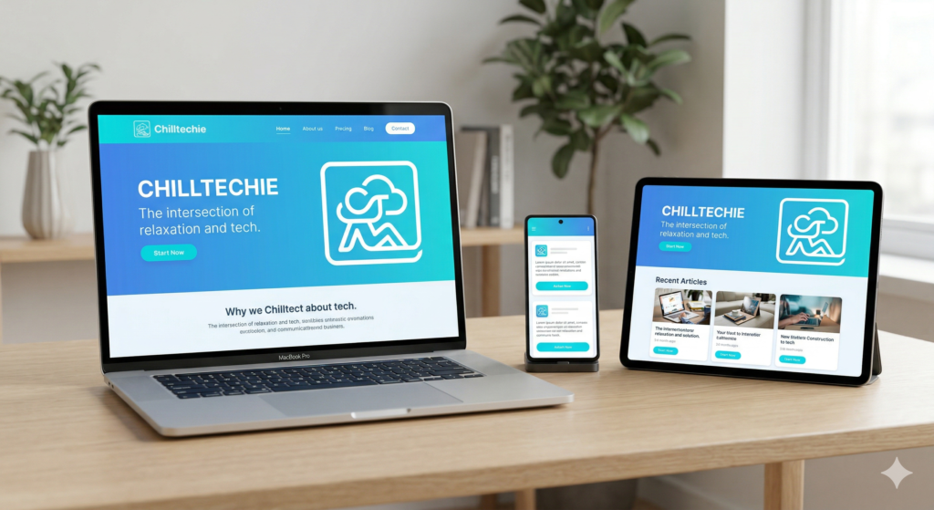
5. Test It on Different Devices
A color that looks “chill” on your MacBook might look “neon” on a mobile screen. Always check your site on:
- A High-res Desktop
- A Tablet
- A Smartphone (iOS and Android)